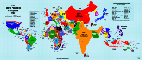
 World maps distort — it’s inherent in their design.Take a spherical object (the Earth) and try to represent it on a flat plane (paper), and some parts of the sphere are going to get stretched. On most maps, Canada and Russia get puffed up, while countries along the equator get shrunk.Every now and then, though, you stumble across a map that enlightens.That’s how we felt when we saw the awesome mapmade by Reddit userTeaDranks. The map resizes countries based on their population. It’s simple: Each square represents 500,000 people.TeaDranks posted the graphic on Reddit’s “map porn” discussion on Jan. 16. He calls it his “magnum opus.”Image: TeaDranks/via Imgur
- SOME MORE BLOGS:
Tuesday, March 03, 2015
countries/population resizing

Subscribe to:
Post Comments (Atom)
No comments:
Post a Comment